


28-inch 4K HDR 1ms Gaming Monitor | EL2870U
৳ 36,500.00
- 28-inch 4K (UHD) High Resolution
- Panel type: Innolux M280DGJ0 variant TN (Twisted Nematic) LCD.
- Native resolution: 3840 x 2160.
- Typical maximum brightness: 300 cd/m²
- Colour support: 1.07 billion (8-bits per subpixel plus dithering)
- Response time (G2G): 1ms.
- Refresh rate: 60Hz (variable, with Adaptive-Sync)
VISA | MasterCard | AMEX ক্রেডিট কার্ড ব্যবহারকারীরা এখন ০% ইন্টারেস্টে ৩/৬ মাসের কিস্তিতে কিনতে পারবেন। কেনার সময় Debit/Credit Card নির্বাচন করে স্ক্রিনে দেয়া নির্দেশনা অনুসরণ করুন।
Advance payment of ৳500 is needed for orders from outside Dhaka via bKash. Please call 01896005975 for payment and confirmation.
- Description
Description
Introduction
The ‘4K’ UHD resolution offers a lot of advantages for both work and play, with both PC and games consoles users able to take advantage of its plentiful pixels. The BenQ EL2870U is a relatively affordable entry into the world of ‘4K’, with a reasonably large screen size and some attractive headline features including support for AMD FreeSync and HDR. We put this monitor through its paces in our usual testing gauntlet to see how it performs out there in the real world.
Specifications
This monitor uses a 60Hz 27.9” TN (Twisted Nematic) panel from Innolux, with support for 10-bit colour (with FRC dithering) and a 3840 x 2160 resolution. A 1ms grey to grey response time is specified, which should as usual be approached with an open mind but is fitting for a product marketed as a ‘4K’ gaming monitor by BenQ. Some key ‘talking points’ of the specification have been highlighted in blue below, for your reading convenience.
Features and aesthetics
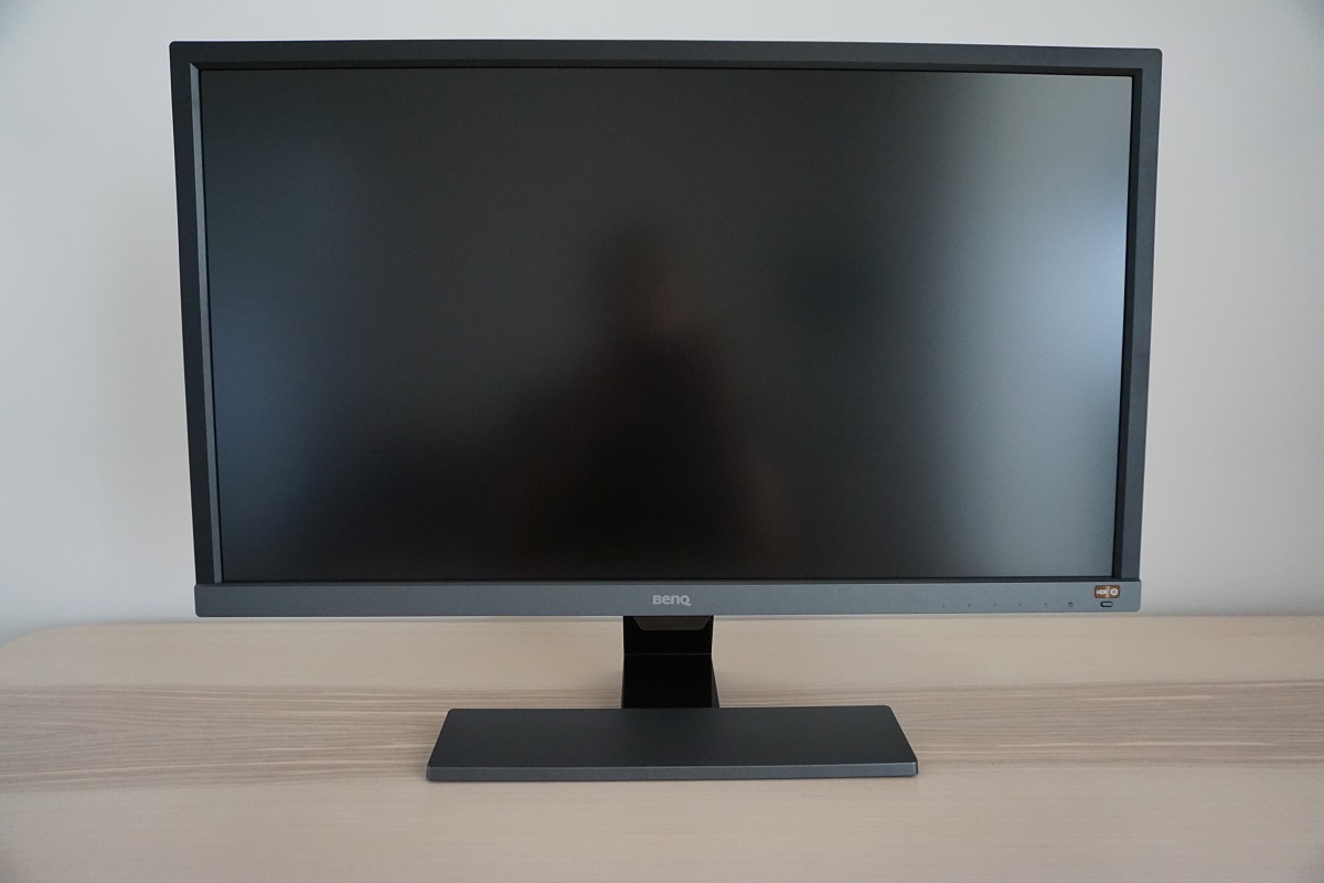
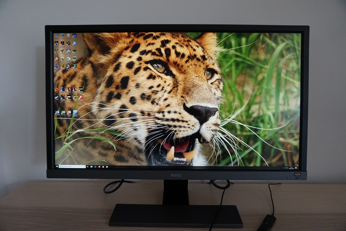
The monitor has moderately thick bezels, with a matte plastic bezel covering pretty much the entire border. The bezels are ~18mm (0.71 inches) thick at the top and sides, including a sliver of visible panel border. The bottom bezel is thicker with a ‘metallic grey’ (medium grey matte plastic) finish, at ~23.5mm (0.93 inches). If you include the sensor unit in the middle the bottom bezel is ~35.5mm (1.40 inches) thick. This little box which hangs down below the rest of the bezel houses the light sensor used for the ‘B.I.+’ feature explored later. The stand neck is glossy black plastic, whilst the base’s outer surface is brushed grey matte plastic. A slightly darker grey than the bottom bezel. The screen surface is medium (or ‘relatively light’, depending on how you choose to classify it) matte anti-glare, as we explore shortly.
The OSD (On Screen Display) is controlled by pressable buttons on the underside of the bottom bezel, towards the right. There is also an ‘HDR/B.I.+’ (High Dynamic Range / Brightness Intelligence Plus) button which allows you to activate or deactivate both technologies independently. This is a forward-facing button with a shiny copper-coloured label above it. It has a vinyl-texture to it rather than being overly eye-catching and ‘blingy’. It stands out enough so you know it’s there, but isn’t something we were distracted by or really noticed when just using the monitor normally. The video below gives a run-through of the OSD menu system.
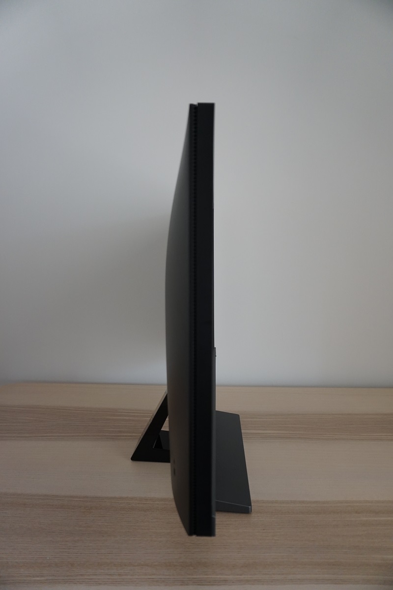
From the side the monitor is fairly slender, ~21mm (0.83 inches) at thinnest point and lumping out a bit centrally and where the stand attaches. The stand affords the monitor tilt (5° forwards, 15° backwards) as the only ergonomic flexibility. The bottom of the monitor (including the B.I.+ sensor unit) clears the desk by ~87mm (3.43 inches) with the top ~482mm (18.98 inches) above the desk surface.
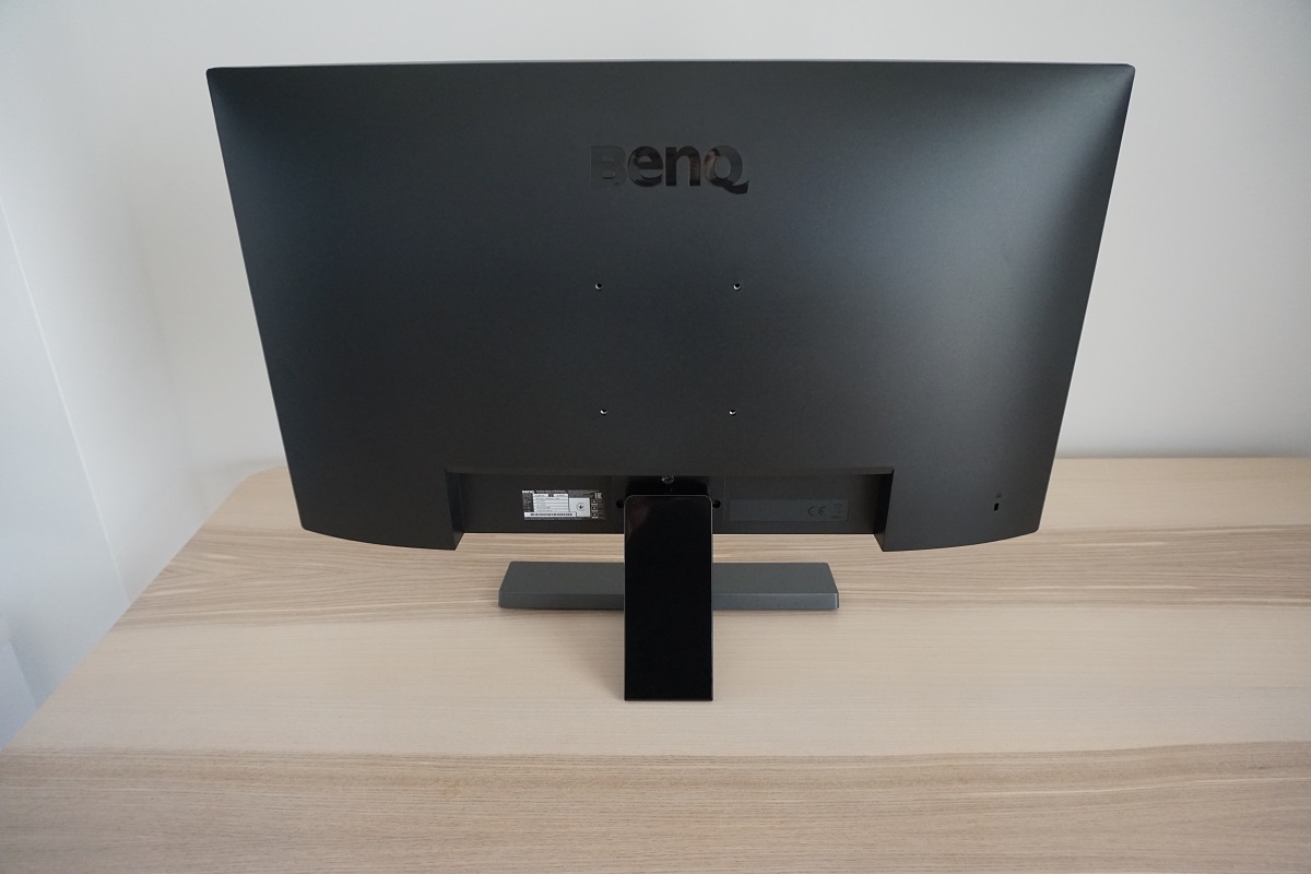
The monitor makes extensive use of matte black plastic at the rear. The stand attaches near the bottom and can be removed if you want to use an alternative stand or mount. The monitor offers 100 x 100mm VESA holes, centrally, for alternative mounting. There’s a K-Slot towards the bottom right. The ports are down-firing, located near the stand attachment point, and include; an AC power input (internal power converter), DP 1.4, 2 HDMI 2.0a ports and a 3.5mm headphone jack. 2 x 2W speakers are also included for basic sound output. These provide sound with pretty decent volume, although the clarity and overall quality leaves a bit to be desired (quite standard for integrated monitor speakers).
The monitor supports AMD FreeSync (via Adaptive-Sync) via HDMI and DP, on compatible AMD GPUs and systems. HDR is also supported on compatible GPUs (not vendor specific) and systems such as games consoles via either DP 1.4 or HDMI 2.0. A power cable and adaptor plus HDMI cable is included as standard, additional accessories vary by region or retailer.
Calibration
Subpixel layout and screen surface
The image below is a macro photograph taken on Notepad with ClearType disabled. The letters ‘PCM’ are typed out to help highlight any potential text rendering issues related to unusual subpixel structure, whilst the white space more clearly shows the actual subpixel layout alongside a rough indication of screen surface. The monitor employs a medium (or ‘relatively light’, depending on how you choose to classify it) matte anti-glare screen surface. This provides good glare handling but also diffuses light emitted from the screen by a moderate amount. This gives lighter shades such as white a bit of a grainy appearance, but not the ‘heavy’ or ‘smeary’ graininess seen on some rougher matte screen surfaces. It also eats away at vibrancy potential more than lighter screen surfaces, but not to an extreme degree.
![]()
As shown in the image above, the monitor uses the standard RGB (Red, Green and Blue) stripe subpixel layout. This is the default expected by modern operating systems such as Microsoft Windows and Apple MacOS. You needn’t worry about text fringing from non-standard subpixel layouts as a Mac user and don’t need to run ClearType as a Windows user – although you may wish to adjust this according to preferences. The subpixel layout and arrangement is quite normal and we had no subpixel-related concerns related to sharpness or text clarity on this model.
Testing the presets
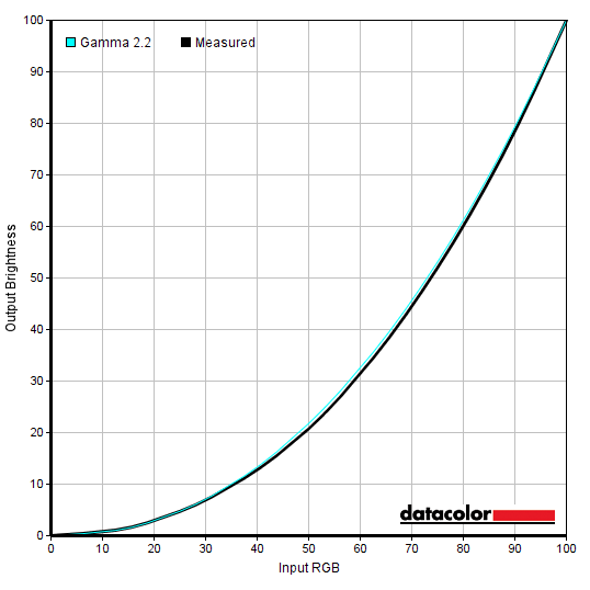
The BenQ EL2870U offers various ‘Picture Mode’ presets; ‘Standard’, ‘HDR’, ‘Cinema HDR’ ‘Low Blue Light’, ‘Game’, ‘Photo’, ‘sRGB’, ‘Rec. 709’, ‘Eco’, ‘M-book’ and ‘User’. There is a variety of other settings that can be adjusted, depending on the preset selected. These extra settings include ‘Gamma’ and ‘Color Temperature’. Some presets, such as ‘Low Blue Light’ and ‘User’ have their own additional associated options (different sub-presets or manual colour channel adjustment). The table below shows key readings taken using a Datacolor Spyder5ELITE colorimeter, alongside general observations, using various settings on the monitor. We won’t test every preset mode as, to put it bluntly, some of them produce an ugly and inaccurate image without any clear benefit to the user. The monitor was left in its ‘Plug and Play’ state without additional drivers or ICC profiles specifically loaded and was left to run for over 2 hours before readings were taken. It was connected to an Nvidia GTX 1080 Ti using a DP cable, on a Windows 10 based PC. Additional testing was performed with a Club3D Radeon R9 290 royalAce FreeSync-compatible GPU. Unless otherwise stated, assume default settings were used. An important step also had to be performed in the graphics driver, even with the monitor connected via DisplayPort on our Nvidia GPU. The colour signal had to be corrected to a ‘Full Range RGB’ signal as detailed in this article. When viewing the figures in this table, note that for most PC users ‘6500K’ for white point and ‘2.2’ for gamma are good targets to aim for.
Out of the box the monitor produced a bright and somewhat cool-tinted image. Saturation levels were reasonable overall, but a bit lower than one would hope for even accounting for the TN perceived gamma shifts. The monitor provides plenty of useful gamma settings, though, allowing you to inject a bit of extra richness into the image. The perceived shifts still occur and you notice a fair loss of saturation lower down the screen, but it’s an overall improvement in richness using the appropriate setting (raising central gamma). The gamma curve shown below is for our ‘Test Settings’, with things tracking quite close to the ‘2.2’ target centrally as measured by the colorimeter. Given the intended uses of the monitor, inter-unit variation and pleasing performance following OSD tweaking alone we will not be providing any ICC profiles for this model or using them in the review.

A number of easily accessible Low Blue Light (LBL) settings are included, which are assigned to a hot key (first OSD button). The strongest setting here, ‘Reader’, was particularly effective in reducing blue light emission from the monitor. Some users will light this sort of setting for more restful viewing, particularly in the evening where blue light exposure should be reduced as much as possible. Blue light is stimulating to the body and is an important alertness signal – the opposite of what you need in the hours leading up to sleep. We liked using this setting for our own viewing pleasure in the evening, although not for general testing purposes (except for parts of the review focused on this setting). We would have preferred that higher gamma was maintained or the ‘Gamma’ setting was still accessible, however.
Test Settings
Our ‘Test Settings’ involved switching to the ‘User’ preset and making some changes to brightness, gamma mode and colour channels. Note that individual preferences and units of the same model vary, so these settings should just be considered a suggestion. Any settings not mentioned below, including contrast, were left at default. Note again that we also corrected the colour signal in the graphics driver, as mentioned in the paragraph preceding the calibration table. We have also included our preferred AMA (Advanced Motion Acceleration) pixel overdrive setting used in the review, just for reference.
Note again that we had to correct the colour signal to ‘Full Range RGB’ as detailed in this article, even when connected via DP on our Nvidia GPU.
Picture Mode= UserBrightness= 50 (according to preferences and lighting)
Gamma= 0
Color Temperature= User Define
R= 100
G= 94
B= 96
AMA= High
Contrast and brightness
Contrast ratios
We used a BasICColor SQUID3 (X-Rite i1Display Pro) to measure the luminance of black and white using various settings. From these values, static contrast ratios were calculated. This data is presented in the table below. Blue highlights indicate the results with HDR active and under our ‘Test Settings’. Black highlights indicate the highest white luminance, lowest black luminance and highest contrast ratio recorded. Assume that any settings not mentioned here were left at default, with the exceptions already noted in the calibration section.
*HDR measurements were made using this YouTube HDR brightness test video, running full screen at ‘2160p HDR’ on Google Chrome. The maximum reading from the smallest patch size (measurement area) that comfortably covered the entire sensor area and colorimeter housing was used for the white luminance measurement, which was ‘4% of all pixels’ in this case. The black luminance was taken at the same point of the video with the colorimeter offset to the side of the white test patch, equidistant between the test patch and edge of the monitor bezel.
With only brightness adjusted, the contrast ratio averaged 853:1. This is a bit below the specified 1000:1, but not too far off and much in line with what you’d typically see for a panel of this type. A marginally higher peak contrast was achieved with the colour channels set to their neutral position (‘Color Temperature = User Define’), at 876:1. The HDR emulation settings did not yield an improvement in contrast and neither did the actual HDR settings with HDR content used – this was not surprising to us as the backlight offers no local dimming capability. The peak luminance was not improved by HDR either, although this was as expected given the specifications of the monitor. The ‘Low Blue Light’ (LBL) settings reduced contrast to as low as 626:1 with the ‘Reading’ setting – not an extreme reduction for the significant changes made to colour channels with those settings active. Under our ‘Test Settings’, which involved some adjustments to colour channels, contrast was a reasonable 810:1. The highest luminance recorded in this table was a reasonably bright (but not by HDR standards) 324 cd/m², whilst the lowest white luminance was a nice dim 28 cd/m². This yielded a 296 cd/m² luminance adjustment range.
A ‘Dynamic Contrast’ setting is also present if you’re running the monitor in the ‘Standard, ‘Game’ or ‘Photo’ presets, with ‘B.I.+’ disabled. This can be set between ‘1’ and ‘5’, with higher numbers increasing the speed of response to changes in scene brightness. With this setting enabled, the backlight brightness is allowed to dynamically adjust in response to changes in light and dark on the screen. As already noted the backlight does not have any sort of local dimming and as usual for a ‘Dynamic Contrast’ setting the backlight is controlled as a single Backlight Unit (BLU). This means the entire backlight is just adjusting its brightness based on the overall levels of light and dark in the scene, not accounting for intricate mixtures of the two. Even with mixed content displayed we found the screen uncomfortably bright and didn’t find the setting in any way advantageous. We prefer manual brightness control.
B.I.+ (Brightness Intelligence Plus)
B.I.+ (Brightness Intelligence Plus) can be thought of as an enhanced Dynamic Contrast setting. The regulates its backlight brightness and makes other adjustments (such as gamma) based on the levels of light and dark in the image, as can be achieved with a regular Dynamic Contrast setting. But it also takes into account the ambient lighting in your room. It uses a light sensor contained in the underhanging sensor unit shown earlier in the review to measure the ambient light levels and adjust the backlight brightness, colour temperature, gamma and other aspects of the image based on this. The B.I.+ feature can be activated in various presets with the selected preset acting as a base to which changes are then made. So if you were to activate the setting on top of an LBL setting, it would bias things towards warmer colour temperatures. As explored in the OSD video you can adjust the sensitivity of the sensor in increments of 10 (between ‘0’ and ‘100’) if you’re finding it too reactive or not reactive enough to slight brightness changes in the room.
We’ve explored this feature in some detail in this section of our BenQ EW2770QZ review. It worked much the same way on this model, so we won’t be repeating too much of this here. Essentially, every user has different sensitivity to brightness. And having the monitor dictate screen brightness itself, with no user-side flexibility or input, is not useful. The constant fluctuations based on changes in ambient lighting and indeed the scene, across the entire monitor, were at times annoying and moreover not in line with our own personal preferences. We also found the changes made to colour temperature fell outside our personal preferences for a given time of day and not usually corresponding in a logical way to room lighting. It’s a feature that aims to do too much at once and lacks sufficient flexibility to make it useful.
PWM (Pulse Width Modulation)
The BenQ EL2870U does not use PWM (Pulse Width Modulation) to regulate backlight brightness at any level. DC (Direct Current) is used to regulate backlight brightness, so the monitor is considered ‘flicker-free’. This will come as welcome news to users who are sensitive to flickering or other side-effects of PWM usage. As with many monitors, FRC (Frame Rate Control) dithering is used whereby the monitor alternates between a slightly lighter and darker variant of a shade. This allows the user to perceive an intermediate between these shades, a shade which the monitor can’t physically display without using this technique. The brightness fluctuations during dithering are usually very slight and it’s not something we usually mention due to this, but on this model there were some shades displayed using particularly aggressive dithering. The medium grey background of Twitter when you click on a single Tweet, for example, showed more noticeable brightness fluctuations than typically observed with dithering and appeared to flicker. This is highlighted in the section of the video review below.
Luminance uniformity
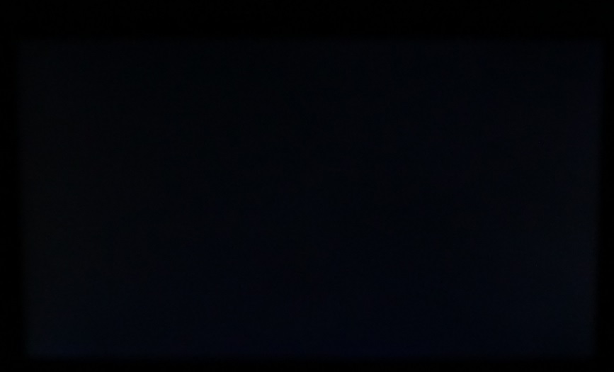
We observed a black background in a dark room and observed slight backlight bleed towards the bottom of the monitor. The image below shows this, using camera settings that were representative of what the eye sees when observing the monitor in a dark room. It’s important to remember that individual units may vary in this regard. You can also observe a slight silver or golden sheen, depending on angle, if you view the monitor from a sharp angle. This appears to ‘bloom out’ as the viewing angle is sharpened further. It’s very different to ‘IPS glow’ and isn’t readily observed from a normal viewing position nor as obvious from steeper angles in comparison. The viewing angle video later on illustrates this.
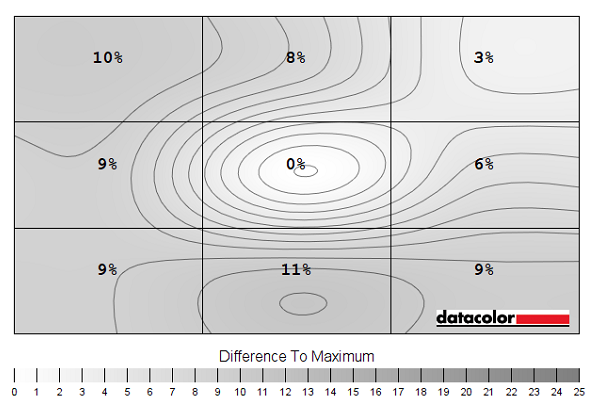
The Spyder5ELITE colorimeter was used to analyse the uniformity of lighter colours, represented by 9 equidistant white quadrants running from the top left to bottom right of the screen. The table below shows the luminance recorded at each quadrant and the deviation between a given quadrant and the brightest quadrant.
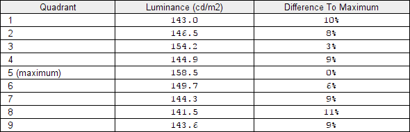
The luminance uniformity of the screen was good overall. The brightest point recorded was ‘quadrant 5’ in the centre of the screen (158.5 cd/m²). The greatest deviation from this occurred at ‘quadrant 8’ below the central region (141.5 cd/m², which is 11% dimmer). The average deviation between each quadrant and the brightest point was 8.13%, which is good. Note that individual units vary when it comes to uniformity and that there can be further deviation beyond the points measured. Also note that the viewing angle limitations of the panel introduce differences in perceived luminance that aren’t accounted for in these measurements, with variation depending on which part of the screen you’re observing. The contour map below gives a graphical representation of the deviations. Darker greys represent lower luminance and therefore greater deviation from the central point than lighter greys.
Due to the aforementioned viewing angle limitations, we will not be providing colorimeter-based analysis of the colour temperature uniformity of the monitor. The perceived colour temperature can vary significantly depending on which part of the screen you’re observing, from a normal viewing position. Any readings provided here have the potential to be highly misleading.
Contrast in games and movies
On Battlefield 1 (BF1) the monitor provided a decent contrast performance overall. Detail levels in dark scenes were largely appropriate, for the central bulk of the screen, with fairly subtle details such as material textures inside buildings visible. Further up the screen there was a significant loss of detail, whilst further down the screen excessive detail was visible as many dark shades appeared significantly lighter than intended. This is related to the viewing angle dependency of the monitor’s gamma curve, a typical TN trait. There was no ‘IPS glow’ or anything of that nature, so at least that was avoided. Lighter elements such as the moon at night and the daylight sky appeared with a bit of a grainy look to them, but not a strong ‘smeary’ graininess as observed on some matte surfaces.
Dirt Rally provided a similar experience, with the monitor showing decent contrast overall. Detail levels were good for the central mass of the screen, in dark areas, with details such as car tire tread patterns visible in a believable way. There was no ‘IPS glow’ which would eat away at detail and atmosphere in dark scenes towards the bottom corners of the screen in particular. However; lower down the screen excessive detail was revealed and these subtle elements appeared ‘blocky’ and unnatural. Further up the screen they were too readily blended and a fair degree of detail in these dark scenes was lost. Typical, again, for a TN panel. Brighter elements such as car headlights stood out quite nicely against darker surroundings, particularly when present higher up the screen – with a bit of graininess from the screen surface. We also observed the Blu-ray of Star Wars: The Force Awakens. This title has a lot of high-contrast scenes where bright elements such as explosions and light sabers are set against the deep dark depths of space. Or dark building interiors, which also works. This title didn’t really have the contrast-rich and cinematic look it craved, but that is only really presented well on models with much stronger static contrast (e.g. VA panels). The brighter elements still stood out quite well against darker surroundings and it was nice not to have the atmosphere interrupted by ‘IPS glow’. Although the perceived gamma shifts mentioned earlier did still apply.
Lagom contrast tests
The Lagom tests for contrast allow specific weaknesses in contrast performance to be identified. The following observations were made.
-
- The contrast gradients were displayed well overall, with distinct brightness steps in all cases. Due to vertical viewing angle weaknesses and perceived gamma shifts, shifting the head down or displaying a shade further up the screen made it blend into the background more readily and eventually disappear. This is typical for a TN panel.
-
- Performance on the black level tests was good from a normal viewing position. All but the first few blocks were visible against the background – these should appear nicely blended for a monitor tracking the ‘2.2’ gamma curve. As usual for a TN panel, there are pronounced vertical gamma shifts. Shifting your head or simply moving the shade position on screen affects its visibility and how light or dark it appears. There was a degree of dithering evident but it was well-masked on the shades shown in this test.
-
- Performance in the white saturation test was strong overall. All checkerboard patterns were visible against the background, although the final pattern was quite faint. It could be revealed by raising its position on the screen or lowering your head a bit. From a normal viewing position it was masked by a bit of graininess from the screen surface and wasn’t distinct from the background.
- The greyscale gradient appeared quite smooth overall. There was minor banding and for the most part dithering was well-masked. There was some more obvious dithering for some of the medium shades and they appeared to flicker, much as in the example we discussed in the PWM section earlier in the review.
Colour reproduction
Colour gamut
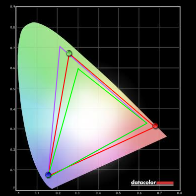
The EL2870U’s colour gamut (red triangle) was compared to the sRGB reference colour space (green triangle), as shown below. The monitor offers reasonably comprehensive sRGB coverage (97%), with a bit of under-coverage in the red and blue region and a bit of over-coverage in the green region. This allows the monitor to potentially output most shades within the sRGB colour space and gives a bit of extra saturation in places. The monitor certainly doesn’t have a generous colour gamut by modern standards, though, and falls well short of the near-term target of DCI-P3 for HDR. For comparison, the DCI-P3 colour space is >130% sRGB and comfortably clears sRGB in all regions of the gamut, particularly green in this representation.

Colour in games and movies
On Battlefield 1 (BF1) the monitor presented colours in a reasonably rich and vibrant way overall. The appropriate central gamma handling went a long way to avoiding the ‘washed out’ look that some models represent. Shades had largely appropriate depth and saturation for the central bulk of the screen, with some fairly rich and lush-looking greens and rich earthy browns giving the environments a natural appearance. Vibrant elements such as roaring orange flames appeared fairly rich, too, although not with the same vibrancy or ‘pop’ as some models (particularly those with more generous colour gamuts). Further down the screen things did appear noticeably undersaturated, whilst further up there was excessive depth. This is related to the aforementioned perceived gamma shifts and TN viewing angle weaknesses. Dirt Rally provided a similar experience. Reasonably rich and natural colours overall. No eye-catching vibrancy for car liveries and some forest greens appearing less lush and saturated than ideal, especially lower down the screen. But still some decent depth overall. And a clear avoidance of the ‘washed out’ look universally presented by models where central gamma is too low.
Finally, we made some observations using the Blu-ray of Futurama: Into the Wild Green Yonder. This is an excellent test for colour consistency, with large areas of individual shade filling the screen. The shifts in gamma and saturation were abundantly clear here, with shades such as the skin tone of a character appearing correct centrally but too deep further up the screen and anaemic and significantly under-saturated lower down. These weaknesses apply to all TN panels, to a degree, and the shifts in saturation here are not as bad as on some TN models we’ve seen (even with smaller screens than this). The shade categories appear broadly correct in that deep and neon shades look appropriately distinct from their more muted pastel counterparts. This certainly helps things look more appropriate and enjoyable to view than on models with significant gamma calibration issues, which fortunately this one didn’t have.
Viewing angles
Lagom’s tests for viewing angle tests were used to further explore colour consistency and viewing angle performance. The following observations were made from a normal viewing position, eyes around 70cm from the screen.
-
- The purple block appeared lilac towards the top and quickly transitioned to pink lower down, with the pink hue readily shifting with head movement.
-
- The red block appeared quite a vibrant red towards the top third of the screen, transitioning to a burnt red lower down and eventually a pinkish red towards the bottom. This pinkish hue readily shifted alongside head movement.
-
- The green block appeared a yellowish green throughout, more saturated and deeper (with less yellowing) towards the top of the screen and noticeably yellower and less saturated towards the bottom.
-
- The blue block appeared deep blue throughout.
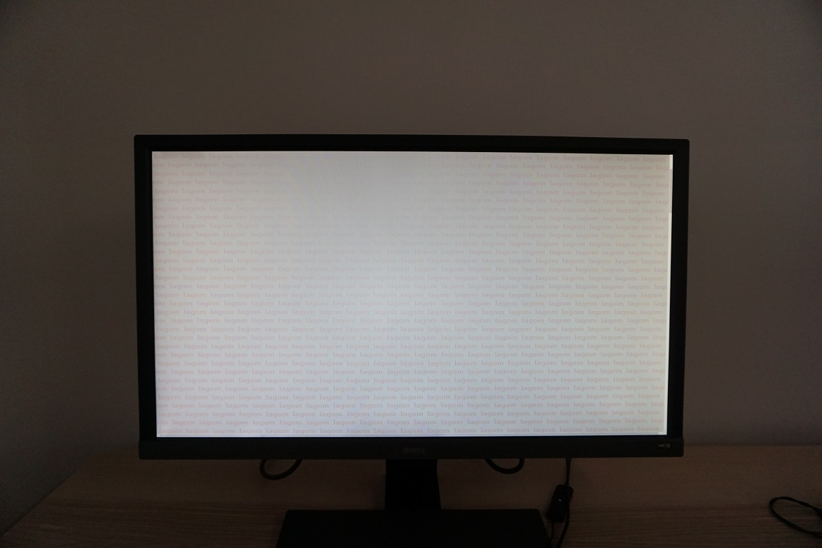
- The Lagom text appeared with a red striping to the text throughout, appearing more weakly saturated (slightly orange) near the top of the screen. This red striping readily shifted to orange and green alongside head movement. This indicates a strong viewing angle dependency to the gamma curve of the monitor, typical for a TN panel. The photo below gives a rough idea of how the Lagom text test appeared.
The following video shows the Lagom text test, a mixed desktop background and dark desktop background from various viewing angles. You can see some shifts in contrast and colour from steeper viewing angles, particularly vertically where the shifts are pronounced, and some colour inversion eventually ensues. The final section of the video highlights some ‘TN glow’ observed from steeper viewing angles.
Interlace pattern artifacts
On some monitors interlace patterns can be seen during certain transitions. We refer to these as ‘interlace pattern artifacts’ but some users refer to them as ‘inversion artifacts’ and others as ‘scan lines’. They may appear as an interference pattern or mesh or interlaced lines which break up a given shade into a darker and lighter version of what is intended. They often catch the eye due to their dynamic nature, on models where they manifest themselves in this way. Alternatively, static interlace patterns may be seen with some shades appearing as faint horizontal bands of a slightly lighter and slightly darker version of the intended shade.
We did not observe any static interlace pattern artifacts, although we did observe some dynamic interlacing patterns in places. When scanning the image or observing motion on the screen, some shades appeared to break up into slightly darker and lighter variants of the intended shade as described in the first paragraph. This was most obvious when moving your head backwards or forwards whilst looking at the monitor. The interlacing was very fine and faint so won’t bother most users, but some could find them bothersome.
Responsiveness
Input lag
A utility called SMTT 2.0 was used alongside a sensitive camera to compare the latency of the EL2870U with various monitors of known input lag. We took over 30 repeat readings to maximise accuracy. Using this method, we measured 2.70ms (~1/4 of a frame at 60Hz) of input lag. This value is influenced both by the element of input lag that you see (pixel responsiveness) and that which you feel (signal delay). It is the lowest input lag we’ve measured on a UHD monitor so far and indicates a very low signal delay that even sensitive users shouldn’t find problematic. Note that we have no way to accurately measure input lag of the monitor running HDR content or with FreeSync doing its thing in a variable refresh rate environment. The HDR emulation mode (SDR content) did not have a significant measurable effect on latency, however.
Perceived blur (pursuit photography)
In our responsiveness article we explore the factors which influence monitor responsiveness. One of the key concepts explored is ‘perceived blur’, which is caused predominantly by eye movement as motion is followed on a screen. A secondary but still important contributor to this is the pixel responsiveness of the monitor. A technique called ‘pursuit photography’ is also explored, which uses a moving rather than stationary camera to capture motion in a way that reflects both eye (camera) movement and pixel responsiveness. The images below are pursuit photographs taken using the UFO Motion Test for ghosting, with the test running at the default speed of 960 pixels per second. This is a good practical speed for such photography, highlighting the key elements of perceived blur nicely. The UFO moves across the screen from left to right at a frame rate matching the refresh rate of the display (60fps @ 60Hz in this case). All background shade levels (dark, medium and light) were used and all three ‘AMA’ (‘Advanced Motion Acceleration’) settings on the monitor were tested. The final image shows a 60Hz reference monitor (Dell S2417DG) which offers rapid pixel responses without using excessive grey to grey acceleration. This gives an idea of what things look like where pixel responsiveness isn’t really a limiting factor.
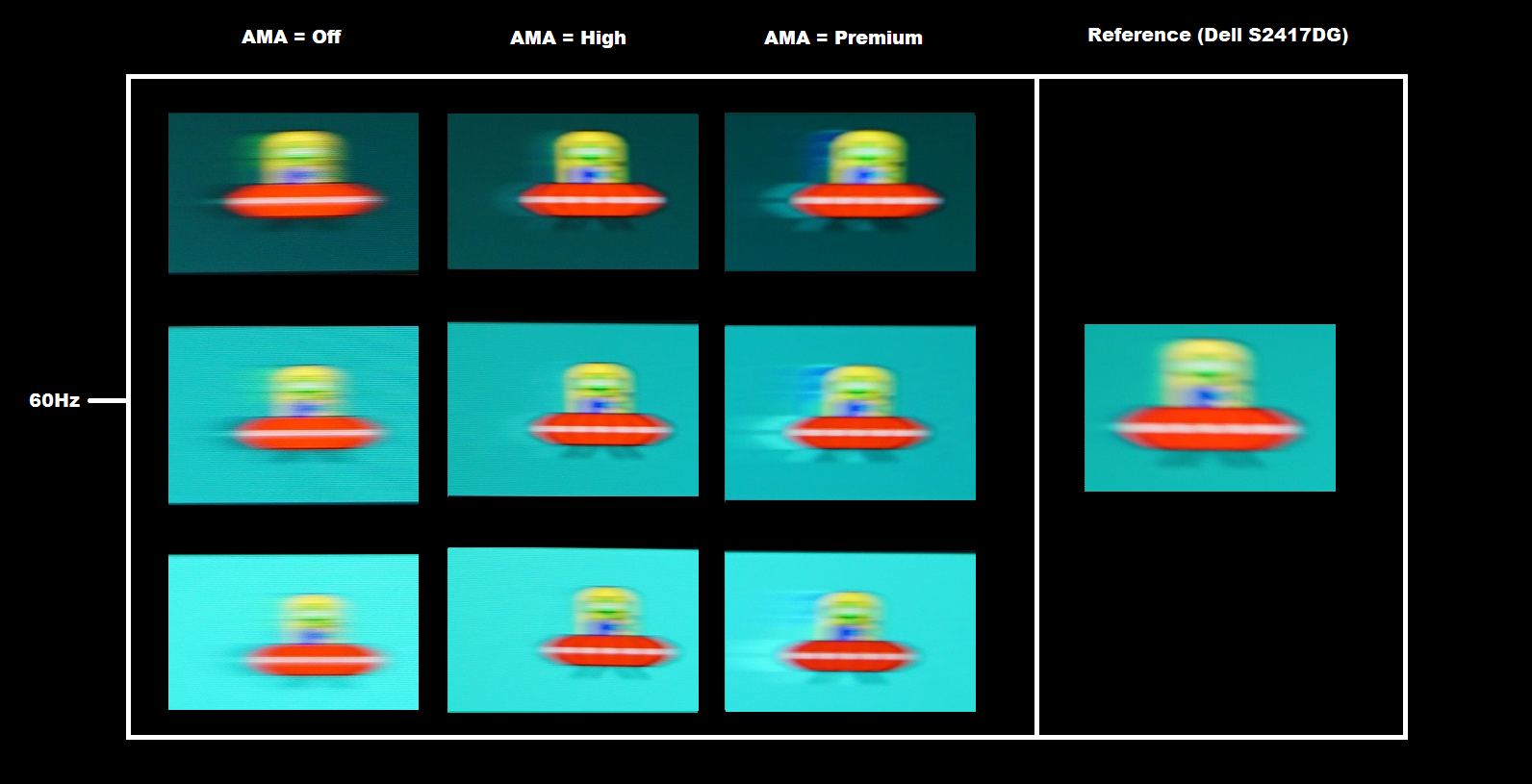
In the images above you can see that the UFO itself appears soft and unfocused. This reflects a moderate degree of perceived blur due to eye movement and is tied to the 60Hz refresh rate – which is why this aspect is the same for the reference image. There are also varying degrees of trailing behind the UFOs, varying most notably as the ‘AMA’ setting is changed but also with a degree of variation between the different background shades. ‘AMA = Off’ provided a fair amount of trailing behind the object, strongest for the dark background (top row). Setting ‘AMA’ to ‘High’ eliminated this conventional trailing and instead replaced it with some overshoot (inverse ghosting). You can see a ‘ghostly’ (bright or ‘halo’ trail) behind the object in all cases. It’s most pronounced for the dark background, not really very strong for the medium background and practically invisible for the light background. The ‘Premium’ setting ramps up the pixel overdrive and causes extreme overshoot. There is obvious colourful trailing behind the object in all cases. From this analysis and considering using the monitor more broadly (as we come onto in the next sub-section) we found ‘AMA = High’ to be the best setting.
Note that we will not be including a section on overclocking. The monitor could not be set much beyond 60Hz without frame skipping occurring or the monitor simply refusing to display an image.
Responsiveness in games and movies
On Battlefield 1 (BF1) there was a moderate degree of perceived blur. This was mostly attributable to eye movement and linked to the 60Hz refresh rate. The monitor was able to perform most of its pixel transitions fast enough for optimal 60Hz and 60fps performance, meaning things looked as good as you can expect from any 60Hz LCD in this respect. There were some weaknesses, though, which really highlight why you need to look past specified response times (1ms in this case). There was quite widespread overshoot (inverse ghosting), with a bit of bright trailing behind objects. This was generally quite faint and not eye-catching. There were some examples of more eye-catching bright ‘halo’ trailing, though, particularly where dark shades moved against significantly lighter backgrounds. You could see a trail that was significantly brighter than the background colour and that looked somewhat colourful. Not as extreme as shown with ‘AMA Premium’ in the TestUFO photos, but still quite eye-catching to us. There were also a slim number of transitions that were performed at slower than optimal speeds, leading to some conventional trailing. Lighter objects with somewhat darker backgrounds such as the moon in the night sky often showed this. These trails were not particularly ‘thick’ or bold and didn’t appear smeary as you might see on some VA (Vertical Alignment) models. But they were extensive enough to make it seem like a fainter repetition of the object behind it during motion. The segment of the video review below runs through some of these weaknesses and also discusses some of the relative strengths of the monitor when it comes to responsiveness.
We made similar observations on Dirt Rally. There was a moderate degree of perceived blur even when driving fairly slowly, but this was largely attributable to eye movement and as you’d see on the fastest 60Hz LCDs. There were some weaknesses in terms of overshoot and some slower than optimal pixel transitions, giving some extra trailing in places. The most eye-catching of this were some bright halo trails when driving at night, where dark shades moved against a significantly brighter background. This was not extreme (compared, for example, to running the monitor with ‘AMA’ set to ‘Premium’) and similar to the examples described and shown in the video above for BF1. We also observed our Blu-ray test titles where there were no real stand-out weaknesses. There was a bit of overshoot in places, but this was faint and short-lived. The fluidity of this content was limited by the frame rate at which it runs (~24fps) which doesn’t expose weaknesses in the same way as higher frame rate content. Note that high frame rate movie content (50fps or 60fps) exposes similar weaknesses to our in-game testing.
FreeSync – the technology and activating it
AMD FreeSync is a variable refresh rate technology, an AMD-specific alternative to Nvidia G-SYNC. Where possible, the monitor dynamically adjusts its refresh rate so that it matches the frame rate being outputted by the GPU. Both our responsiveness article and the G-SYNC article linked to explore the importance of these two elements being synchronised. At a basic level, a mismatch between the frame rate and refresh rate can cause stuttering (VSync on) or tearing and juddering (VSync off). FreeSync also boasts reduced latency compared to running with VSync enabled, in the variable frame rate environment in which it operates.
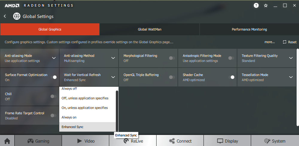
FreeSync requires a compatible AMD GPU such as the Club3D Radeon R9 290 royalAce used in our test system. There is a list of GPUs which support the technology here, with the expectation that future AMD GPUs will support the feature too. The monitor itself must support ‘VESA Adaptive-Sync’ for at least one of its display connectors, as this is the protocol that FreeSync uses. The EL2870U supports FreeSync via DP 1.2a (‘DP 1.2a+’) and HDMI 2.0 on compatible GPUs and systems. If fully installed, AMD drivers feature Radeon Settings, which makes activation of the technology very simple and something that usually occurs automatically. The monitor does not have a dedicated FreeSync section and will automatically operate in FreeSync mode when connected to a correctly setup GPU. To ensure the GPU driver is setup correctly to use FreeSync, open ‘AMD Radeon Settings’ and click on ‘Display’. You should then ensure that the first slider, ‘AMD FreeSync’, is set to ‘On’. If you hover over this, it will also report the variable refresh rate display supported by the display. Note that the image below is for a different monitor and is just used as an example here.

The BenQ supports a variable refresh rate range of 40 – 60Hz. That means that if the game is running between 40fps and 60fps, the monitor will adjust its refresh rate to match. When the frame rate rises above 60fps, the monitor will stay at 60Hz and the GPU will respect your selection of ‘VSync on’ or ‘VSync off’ in the graphics driver. With ‘VSync on’ the frame rate will not be allowed to rise above 60fps, at which point VSync activates and imposes the usual associated latency penalty. With ‘VSync off’ the frame rate is free to climb as high as the GPU will output (potentially >60fps). LFC (Low Frame Rate Compensation) is not supported by this monitor, as that requires the upper limit (ceiling) to be at least 2x the lower limit (floor) of FreeSync operation. FreeSync is therefore deactivated if the frame rate falls below 40fps, with the monitor then respecting your choice of VSync and presenting you with either stuttering (VSync on) or juddering and tearing (VSync off).
VSync is configured in the ‘Gaming’ section of ‘Radeon Settings’, where it is referred to as ‘Wait for Vertical Refresh’. You can either configure this globally under ‘Global Settings’ or for each game individually. The default is ‘Off, unless application specifies’ which means that VSync will only be active if you enable it within the game itself, if there is such an option. Such an option does usually exist – it may be called ‘sync every frame’ or something along those lines rather than simply ‘VSync’. Most users will probably wish to enable VSync when using FreeSync to ensure that they don’t get any tearing. You’d therefore select either the third or fourth option in the list, shown in the image below. The fourth and final option, ‘Enhanced Sync’, is a relatively new addition to the driver. This is an alternative to VSync which allows the frame rate to rise above the refresh rate (no VSync latency penalty) whilst potentially keeping the experience free from tearing or juddering. This requires that the frame rate comfortably exceeds the refresh rate, not just peaks slightly above it. We won’t be going into this in detail as it’s a GPU feature than a monitor feature.
Some users prefer to leave VSync enabled but use a frame rate limiter set a few frames below the maximum supported (e.g. 57fps) instead, avoiding any VSync latency penalty at frame rates near the ceiling of operation or tearing from frame rates rising above the refresh rate. Note that if you go to ‘Information’ in the ‘System’ section of OSD, the ‘Current Resolution’ will show a refresh rate that corresponds to your frame rate with FreeSync active. That is, provided you’re running at a frame rate within the FreeSync range of operation. Note that this only updates when you first enter the ‘Information’ section and does not update in real time. Also note that FreeSync only removes stuttering or juddering related to mismatches between frame rate and refresh rate. It can’t compensate for other interruptions to smooth game play, for example network latency or insufficient system memory.
FreeSync – the experience
As usual we tested a range of titles using FreeSync on this, including; Hitman, Mass Effect Andromeda, Dirt Rally and Wolfenstein II: The New Colossus. The technology worked in much the same way on all of these titles and any potential issues you might come across on one title but not another would likely be down to the game or graphics driver rather than the monitor itself. We’ll therefore be focusing on a single title for this section, Battlefield 1 (BF1). Even with settings set rather conservatively, our Radeon R9 290 rarely maintained a solid 60fps. Without FreeSync enabled even slight dips below this gave obvious (to us) tearing with VSync off or stuttering with VSync on. Note that individual sensitivity to this varies, but it’s relatively easy to notice at these sorts of frame rates on a 60Hz model. FreeSync made these slight drops in frame rate much easier to bear, with a good ‘smooth flow’ maintained to the experience. As frame rate dropped further, particularly towards and then below 50fps and down closer to 40fps, there was a noticeable decrease in ‘connected feel’ and increase in perceived blur. This is linked to the frame rate itself, which FreeSync does not change – although it makes these fluctuations far more palatable, it’s still nice to have your framer as high as possible in terms of visual fluidity.
As noted earlier, this model has a 40Hz (40fps) floor of operation for FreeSync and doesn’t support LFC. If we pushed up the graphics settings to ‘Ultra’ on this title we often dipped below this level, with FreeSync deactivating in a rather noticeable way. 40Hz is actually a relatively low floor for a FreeSync model, they rarely go below this – and as noted above, it’s nice to keep the frame rate higher than 40fps if possible anyway. We didn’t really notice any significant increase in overshoot as the frame rate dropped. This is sometimes an issue with FreeSync models and it’s something G-SYNC models typically handle a lot better – employing ‘variable overdrive’ which loosens off as frame rate decreases and therefore such rapid pixel responses aren’t required. The BenQ had a moderate amount of overshoot anyway, but it was still nice to see it didn’t become extreme at the lower end of the variable refresh rate range.
HDR (High Dynamic Range)
When it comes to displays, HDR (High Dynamic Range) describes the ability to distinctly display very deep dark shades and very bright light shades simultaneously. It is also necessary for a display to be able to display a large variety of shades in between, from weakly saturated to very heavily saturated shades. To achieve this, it would be attractive for a monitor to have hundreds if not more dimming zones on the backlight – something referred to as FALD (Full Array Local Dimming). In an ideal world it would be able to control the brightness of each pixel individually (OLED technology, for example). This capability would allow the monitor to correctly display intricate mixtures of bright and dark content. Some sections of the screen could display dark content with suitably low brightness luminance, whilst other sections of the screen display brighter shades with brilliant luminance. When it comes to colour reproduction on an HDR monitor, the ultimate goal is coverage of a huge colour gamut; Rec. 2020. A more achievable near-term aim is for a monitor to offer 90% DCI-P3 (a Digital Cinema Initiatives standard colour space). Finally, it is required that processing for (at least) 10-bits per channel is supported somewhere in the pipeline, ideally with the monitor supporting this. This allows for high precision when displaying shades for HDR content.
For most games and other full screen applications that support HDR, the BenQ EL2870U will automatically switch into its HDR mode when the appropriate setting is selected in the game/application itself. There are two HDR ‘Picture Mode’ options available as explored earlier in the review; ‘HDR’ and ‘Cinema HDR’. If an application is running in HDR mode then you can’t manually disable HDR on the monitor, even using the shiny copper-coloured button. This will just control B.I.+ in an HDR environment and can also control the HDR emulation mode in an SDR environment. As usual for a monitor, it is specifically the ‘HDR10’ pipeline that is supported. As of the Windows 10 ‘Creator’s update’, HDR support was integrated into the OS with a feature initially called ‘HDR and advanced colour’. This is now referred to as ‘HDR and WCG’ (meaning Wide Colour Gamut). A minority of game titles that support HDR will only run in HDR if this setting is active in Windows and if you wish to view HDR movies on a compatible web browser, for example, you’ll need to activate this setting as well. If you’re not actively viewing HDR content on the desktop then having this enabled can make things appear flooded and washed out, so it’s only supposed to be activated when it’s specifically needed. The setting can be found in ‘Display settings’ (right click the desktop) as shown below.

The BenQ EL2870U doesn’t meet the criteria for even the lowest level of VESA DisplayHDR certification (VESA DisplayHDR 400). Although we’re focusing on PC games for this section, our observations here are indicative of what you can expect when watching HDR movies and also when playing games on HDR capable games consoles. HDR implementations vary from title to title and some are better than others. We tested a range of titles using HDR on this monitor, including Hitman and Battlefield 1. We’ve used both of these titles extensively in our testing of other HDR monitors, so we know that they can put HDR screens to good use and highlight distinct strengths and weaknesses in HDR performance. We also observed some HDR movie content, but this didn’t highlight anything to us that wasn’t highlighted with in-game testing of HDR content.
Starting off with the colour gamut, it extends just a bit beyond sRGB with a bit of under-coverage in some regions. It is a far cry from the ideal >90% DCI-P3 near-term target for HDR. Many shades are given a bit of extra depth with the HDR mode active, but this is due to them being deepened by increased gamma. This effect is a bit more pronounced using the ‘Cinema HDR’ setting. You don’t get anywhere near the saturation levels you’d see from a DCI-P3 colour gamut and things are not represented as the developer intended. To put things in perspective, you can compare the EL2870U’s colour gamut (top image) to that of the LG 32GK850F with a specified 95% DCI-P3 colour space (bottom image). Note that the purple triangle for the LG’s gamut represents the Adobe RGB reference space. Also note that the LG’s HDR performance also left a lot to be desired, but it did at least offer strong DCI-P3 coverage which is more than can be said for this model.
Another important area of HDR is contrast. Your ideal HDR display will be able to simultaneously display very brilliant bright shades and very deep dark shades, with strong distinctions in between. This requires per-pixel illumination, ideally, or failing that a good number of dimming zones for the backlight. This model offers a simple backlight solution, with the backlight controlled as one unit. So there is no way that it can account for intricate mixtures of light and dark. It also has a peak brightness that creeps just a bit above 300 cd/m², falling short of the 400 cd/m² minimum requirement for any level of VESA DisplayHDR certification. As we’ve explored in the contrast section, HDR does not bring any static contrast or brightness advantage. Observing some scenes on Battlefield 1 that we know work very nicely on models with proper HDR support, things looked decidedly lacklustre. One of the best scenes we found for testing HDR contrast involved a bright moon in the sky at night shining through a dimly lit stable, with some bright lanterns providing additional sources of illumination. One potential advantage of HDR is that dark shades are mapped more carefully to aid visibility. When this is coordinated with careful luminance adjustment (requiring a large number of dimming zones) the result is a much more believable scene. Whilst visibility was enhanced in dark areas, there was simply no real depth to the darkest shades. Bright elements were not particularly eye-catching or bright, by HDR standards, and with those dark elements appearing significantly lighter than they should it just gave no depth or atmosphere to the experience. Things simply looked flooded and universally bright, which is not what a true HDR experience is about at all. This was especially true using the regular ‘HDR’ setting, but ‘Cinema HDR’ also exhibited this somewhat flooded experience with a lack of depth or atmosphere. The relevant section of the video review (below) runs through the particular scene referenced here and runs through the HDR experience on this monitor.
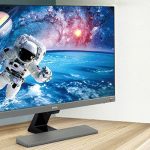
The ‘4K’ UHD experience
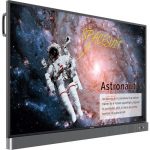
In our ‘4K’ UHD experience article, we take a look at the benefits and drawbacks with the 3840 x 2160 (‘4K’ UHD) resolution on a screen of this size. In fact, the screen used for that article used a slightly older variant of the panel used in the EL2870U. With a 27.9” screen size, the BenQ offers a pixel density of 157.91 PPI (Pixels Per Inch). This is a high pixel density, compared to for example a 27” 2560 x 1440 (WQHD) model with a pixel density of 108.79 PPI. Without applying scaling in Windows or your operating system, text and UI elements look very small. Depending on eyesight, viewing distance and personal preferences some users might find this just fine. Others will need to use a degree of scaling or at least use application-specific zoom. Either for the sake of viewing comfort or simply because it brings things closer to their own size preferences. As noted in the article, we favoured the ‘125%’ scaling level for a screen of this sort of size. You retain an excellent level of ‘desktop real-estate’ with a significant work area, whilst (properly scaled) text appears crisp and readable. The images below give you an idea of the sort of real-estate and multi-tasking potential that the screen delivers with this ‘125%’ scaling level. Refer to the article for comparisons with this and various other scaling levels (including no scaling).
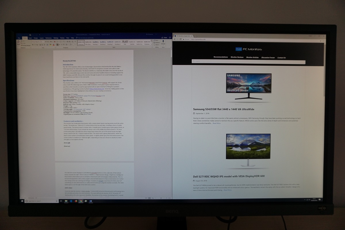
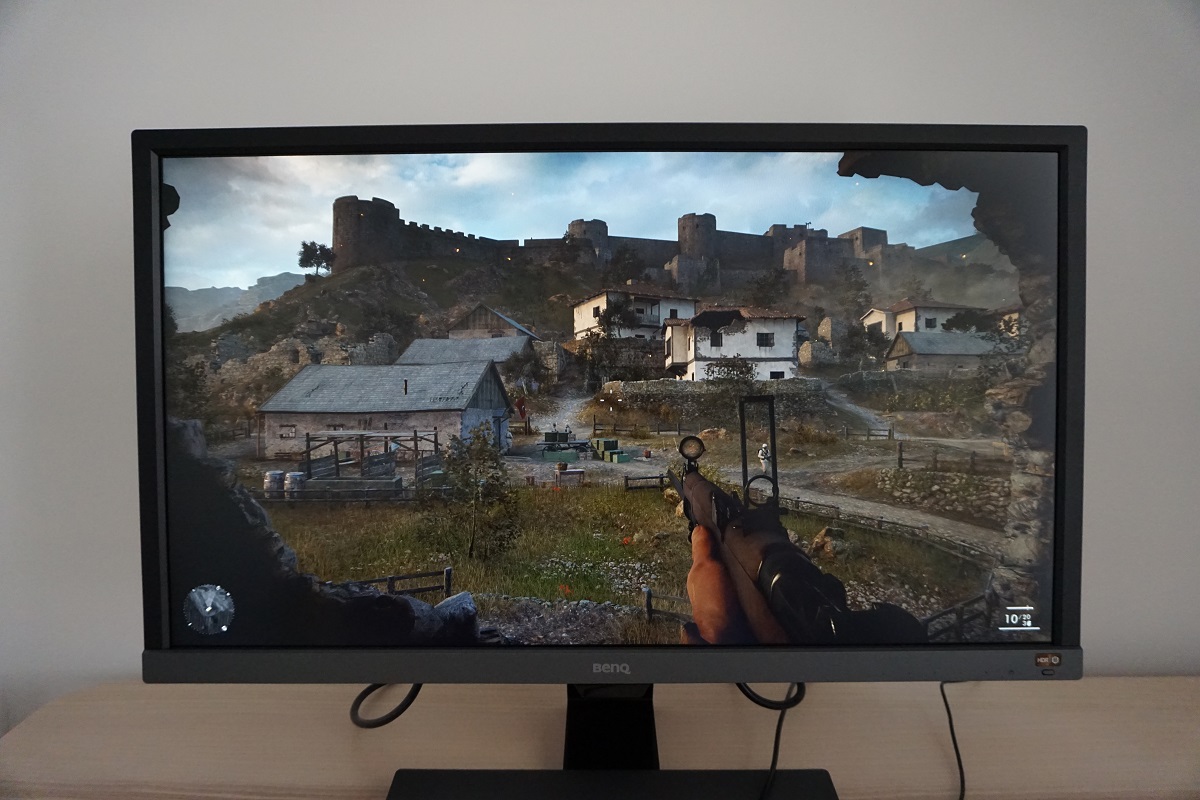
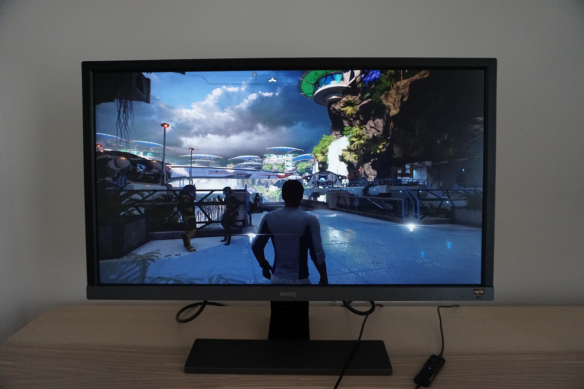
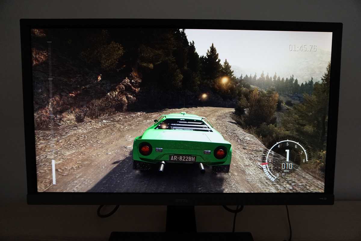
When viewing suitably high resolution images, movie content and in particular games you can see some clear benefits of this excellent pixel density. The level of clarity and detail is a significant improvement over models with a lower pixel density, such as 27” WQHD models. This is particularly true for game titles which employ high resolution textures and special effects – there’s a crispness and detail that just isn’t there on models with significantly lower pixel density. Even if the game is an older title or doesn’t have particularly fancy graphics, you can notice a crispness and definition to objects and edges in the distance. Enemies, trees, houses and other objects stand out in a more distinct way, for example. The higher pixel density also reduces the need for anti-aliasing, although a bit of anti-aliasing and the use of high-resolution textures and special effects certainly enhance the visual appeal. The images below are just there to fire up your imagination and show the monitor in action, they in no way reflect what it looks like first-hand.